
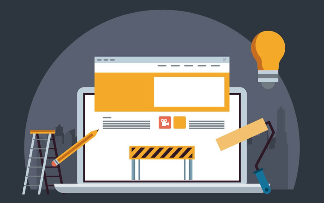
5 Signs Your Website Needs a Redesign
In the current digital environment, a potential customer’s initial impression of your organization will come from its website. This is the first place they will unavoidably go to find out more about your goods and services and, in the end, decide if they want to work with your company. It is your most effective marketing weapon.
The foundation of any digital marketing strategy is a website that is mobile-friendly, responsive and has a contemporary design.
At least not explicitly, your website won’t notify you when it is out of date. Technology is developing more quickly than any other industry. It also implies that compared to other product categories, technology, hardware, and software age far more fast. That list includes your website, whether you like it or not. Even if you have invested hundreds of dollars, engaged the top developer, and included every imaginable feature, it won’t endure over time. Your website will eventually collect dust and start to break down, just like an antique that you’re keeping in the corner of your relative’s house. Fortunately, a few tweaks may breathe new life into those old pieces, and redesigning your websites is something you ought to be doing as well.
Users and consumers will notify you when your website needs to be updated; it won’t do so on its own. Your users have a plethora of options when it comes to websites that resemble yours. To prevent users from searching elsewhere, you must be “keeping up with the Joneses” in terms of technology.
I’ve compiled a list of indicators that your website requires a makeover because your website won’t tell you. Your website should be the finest it can be, much like the tools you use in your business.
Outdated and “Retro” Page Designs and Selections:
When it comes to aesthetics, they are always the easiest to recognize and address. A lot of antiquated design elements, such as low-resolution banner graphics and simple, flat text on monochromatic backgrounds, may be making visitors feel that your website is old. Some fonts appear as though they were taken straight out of the 1990s, and with good reason! More than 60 years ago, typewriters employed some of those fonts. Do you not believe that your website is worthy of more?
You may download hundreds of free fonts from Google and bring your website into the twenty-first century. Stop using Courier on every page.
Low load times and other metrics:
Based on statistical data, approximately 3 out of 4 users will click away from a page that loads more than 5 seconds. These days, bad web hosting has no justification. You shouldn’t expect people to wait for your website to load either, as they aren’t rushing back and forth to check if their modem is connected to a phone line anymore. You should examine web hosting services with the same rigor that I have because I have criticized a number of them for having slow load times and frequent outages.
Make sure you do more research than just a cursory Google search to determine which web hosting companies are the best fit for you.You can evaluate and screen those services in a variety of ways for your website. Even better, you can use Google Pagespeed Insights to test your website and determine whether it should be moved to a new server altogether. In any case, ensure that your website loads swiftly and remove any virtual lineups of visitors.
Unders and Pop-Ups:
Once upon a time, pop-up and beneath menus and banners were a fashionable choice. It was a novel approach to introduce a choice, offer, or menu to a visitor to your website. The issue is that these days, your success is mostly determined by the user experience. A website full of advertisements, whether they are outdated pop-ups or ones that promote your goods or services, is something that no one wants to use.
Mobile browsing can potentially be severely harmed by popup designs. Considering that smartphones account for 60% of all browsing, every website needs a mobile version. Popups on their phone screens with tiny “X”s that are hard to click are the last thing those users need. Give your users the experience they desire instead of hindering them.
Blatant stock images:
Technology advancements have less of an impact on stock photographs than user advancements do. Simply said, stock photographs are becoming easier to identify over time. With so many people using stock photographs to create memes and jokes, website owners are no longer even the only ones who utilize them. Because stock photo shoots have become so popular, some actors and characters have even gone on to become famous.
a generic group of people displaying teamwork by grinning while gazing at a computer screen.
A developer who is irate is shown on their desk with their head buried in their hands.
the back of an applicant’s head as they turn to face a daunting prospective employer.
Play automatically:
I’ve already discussed how important a website’s user experience is to its success. You want visitors to your website to enjoy themselves so they will return. A brief period in the late 2000s and early 2010s saw a lot of websites having movies or music play automatically. In fact, it was a feature for some people! It’s just a nuisance now.
When a strange video or soundbite starts to play on a website and you have no idea where it’s coming from, it may be one of the most annoying experiences. Most users will simply shut the window rather than take 30 seconds to go to your website and stop the auto-playing video.
Outdated Websites = Outdated Business:
Many companies thrive on nostalgia. Their consumers enjoy the same things that they have been providing in the same way for decades. Knowing your market and audience and building your brand around their needs is more important than being obstinate. Businesses like Coke, which have been in the beverage industry for more than a century, maintain the same product, but you can be sure they update their websites.
Your brand is your product. Your brand is in your copy. Your website is a representation of your brand, but your advertisements and language are yours. It should include information about a company’s past that users are interested in seeing, such as FAQ and About Us sections. The stories behind the objects should evoke nostalgia, not the way a customer arranges them. Rather than forcing your market to use a method that appears to be as antiquated as the Coca-Cola formula, a website should have elements that make ordering your goods simple.
A website isn’t “quirky” if it has issues that need to be resolved and is out of date.